Uncover mobile-first vs desktop-first design: advantages, drawbacks, comparisons, and the reason mobile-first prevails for most projects.

Uncover mobile-first vs desktop-first design: advantages, drawbacks, comparisons, and the reason mobile-first prevails for most projects.
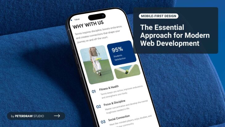
What is mobile-first design? Unlock superior UX, faster loading, better SEO, and higher conversions. Get practical tips and strategies to build responsive sites the smart way.
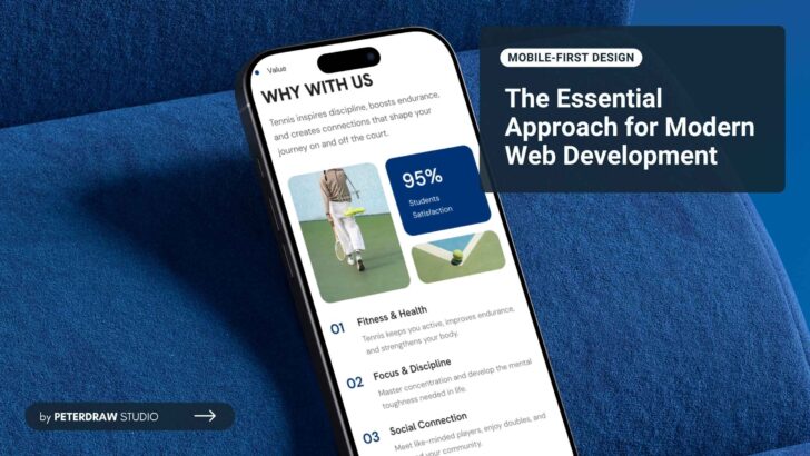
Create a mobile-friendly website optimized for speed, usability, and search visibility in today’s mobile era.

Micro-interaction guide for web UI/UX: learn key types, real examples, and best practices to boost clarity, trust, and engagement.

Unlock 10 dark mode design tips to improve contrast, reduce fatigue, and deliver sleek, accessible interfaces users enjoy day and night.

Stop repeating responsive design mistakes that damage mobile UX, Core Web Vitals, SEO, and critical conversion rates forever.

Avoid costly web design mistakes with practical tips to improve speed, navigation, SEO, and user experience on every page.
Navigation is one of the key elements in UI design, such as a website.

It’s been several years since dark mode gained its popularity. Its elegant look is not the only thing attracting users.

People prefer to access websites from their mobile phones since it is more practical.