Explore experimental navigation, the creative way to make website browsing more engaging and memorable.

Explore experimental navigation, the creative way to make website browsing more engaging and memorable.

Master bold typography with expert tips on where to use it, the best font recommendations, plus practical techniques to make your designs more impactful and memorable.
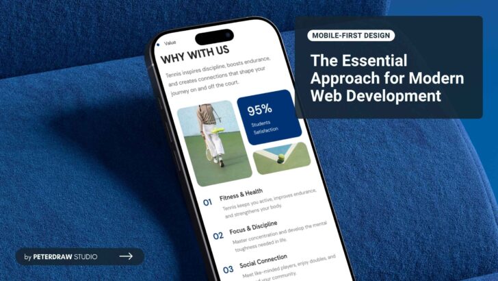
What is mobile-first design? Unlock superior UX, faster loading, better SEO, and higher conversions. Get practical tips and strategies to build responsive sites the smart way.
Create consistent cross-device experiences with responsive design principles, plus tips for components, exports, and previews.

Uncover mobile-first vs desktop-first design: advantages, drawbacks, comparisons, and the reason mobile-first prevails for most projects.

Craving a pro card UI design? Embrace dos for wow-factor cards; dodge don’ts for seamless UX.
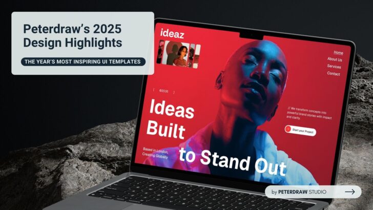
Discover curated Peterdraw 2025 design highlights blending bold creativity, smart layouts, and inspiring visuals across modern digital industries.

Stop repeating responsive design mistakes that damage mobile UX, Core Web Vitals, SEO, and critical conversion rates forever.
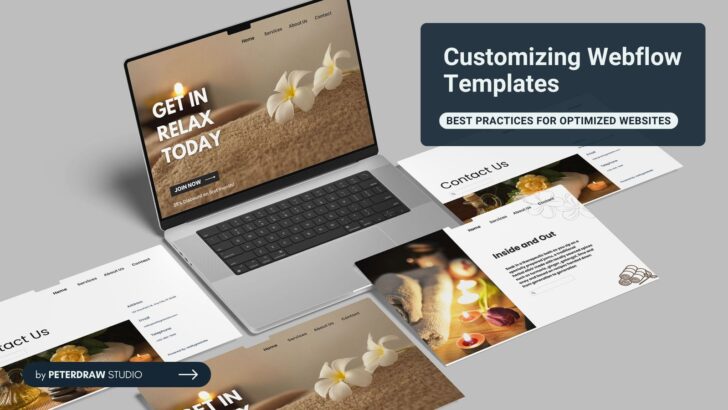
Get practical tips for customizing Webflow templates to build responsive, fast, and professional websites without overwhelming steps.

Explore web design trends in 2026 shaping creativity, performance, sustainability, and ethical digital experiences.